Salesforce Setup Wizard
An evaluative UX research study of Cvent's Salesforce Setup Wizard, using heuristic evaluation, affinity mapping, and usability testing to identify usability issues and deliver evidence-backed design recommendations.
- Role
- UX Researcher
- Year
- 2023
- Team
- Cvent
- Tools
- Figma, Miro, Confluence
Overview
Cvent
Cvent is an event management platform that helps organizations plan, manage, and execute in-person, virtual, and hybrid events while integrating attendee and event data with business systems like Salesforce.
Cvent Salesforce Setup Wizard
The Cvent Salesforce Setup Wizard is a guided onboarding experience that helps Salesforce administrators configure the integration between Cvent and Salesforce. It streamlines account connection, field mapping, data synchronization, and configuration into a structured workflow, reducing setup complexity and enabling reliable data exchange between the two platforms.
My objective
To evaluate the usability of the Cvent Salesforce Setup Wizard by identifying user pain points and translating research insights into design recommendations that simplify onboarding, reduce dependency on customer support, and improve the overall setup experience.
Problem
The existing Salesforce integration setup was complex, manual, and time-consuming for administrators.
- Administrators relied heavily on documentation and customer support to complete the setup successfully.
- A high volume of support requests and setup-related complaints increased the workload on Cvent's Customer Success teams.
- The setup process involved multiple prerequisites across both Cvent and Salesforce, making it difficult to understand and configure correctly.
- Manual configuration increased the risk of errors, leading to delays in onboarding and data synchronization.
- To address these challenges, Cvent introduced the Salesforce Setup Wizard, which required a UX evaluation to validate its usability and identify opportunities for improvement.
Challenge
- Limited access to actual Salesforce Admins; research relied on Customer Support teams and SMEs.
- Understanding a complex Salesforce–Cvent integration workflow before evaluating usability.
- Distinguishing UX issues from product and technical limitations.
- Synthesizing findings from multiple research methods into prioritized design recommendations.
My Role
I worked alongside the UX Lead, Product Manager, Customer Success team, and Subject Matter Experts to evaluate the Salesforce Setup Wizard. My responsibilities included planning and conducting UX research, creating moderator guides, performing heuristic evaluations, synthesizing findings through affinity mapping, prioritizing usability issues, and translating insights into actionable design recommendations.
Process
The setup that needed fixing
Before the Setup Wizard, admins had to switch between the Cvent Salesforce App, documentation, and the Cvent Event App to complete setup. The process was complex, leading to frequent support requests.
Why Evaluate the Setup Wizard?
The Salesforce Setup Wizard was introduced to simplify the app configuration process by guiding admins through setup, reducing reliance on documentation, and minimizing support requests. It organized the setup into three stages — Connect to Cvent, Match Attendee Data, and Sync Attendee Data — with guided instructions, progress tracking, and the ability to resume later.
Since the experience was designed based on internal stakeholder workshops rather than validated with Salesforce admins, the usability and effectiveness of the new workflow needed evaluation.
Journey Mapping
Mapped the old and new setup flows screen by screen to identify simplifications, redundancies, and remaining usability challenges.
The Salesforce admin persona
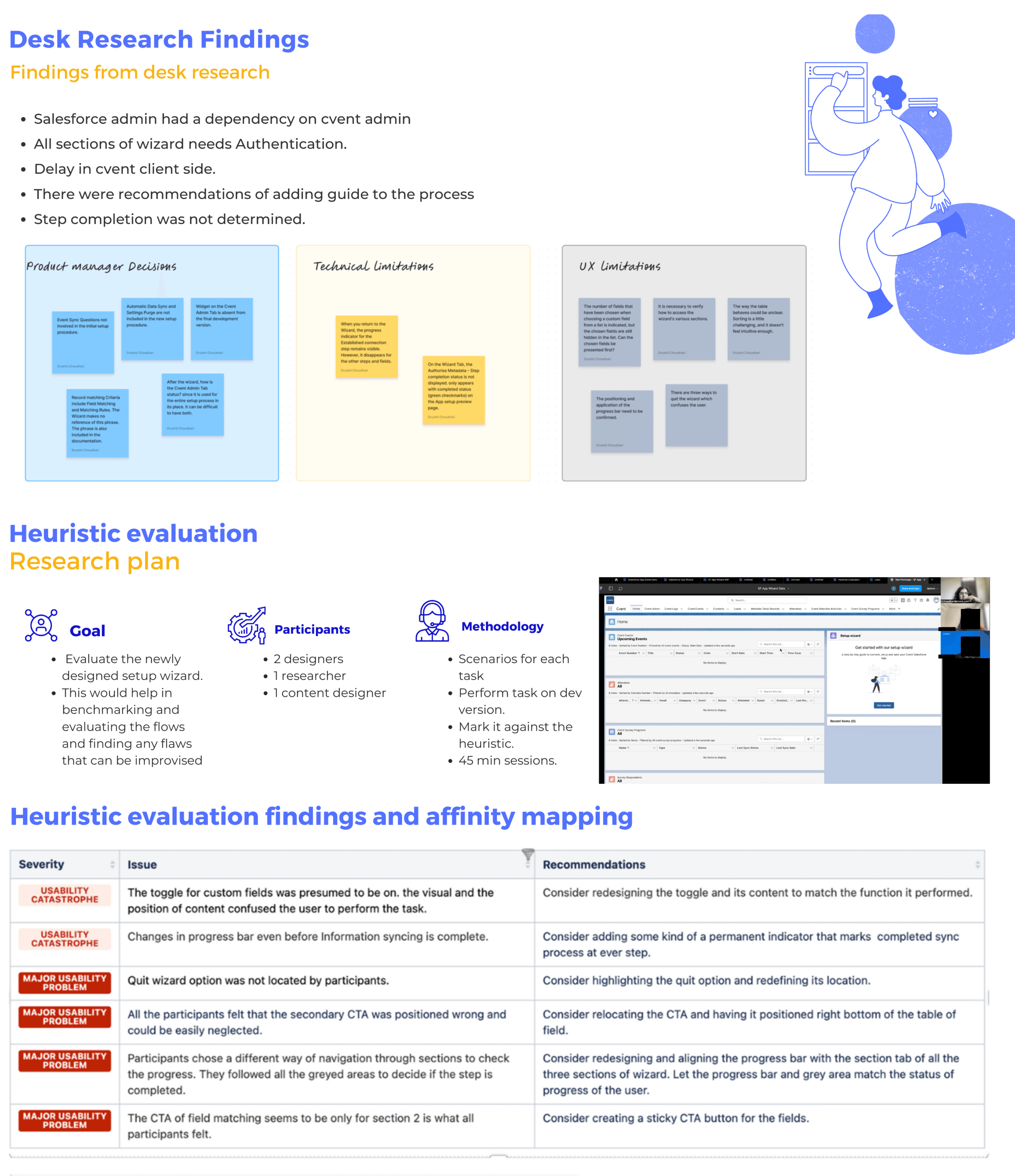
What the desk research surfaced
I also pulled together the post workshop findings and the areas the team wanted to focus on, so the evaluation that followed had a clear target rather than a blank slate.
Heuristic Evaluation
Evaluated the Setup Wizard against Nielsen's usability heuristics to identify usability issues, assess their severity, and uncover opportunities for improvement.
Evaluation method
The brief: the severity scale and the heuristics we evaluated against.
Severity Analysis
Severity ratings were used to prioritize usability issues, helping identify the most critical pain points that required immediate design attention.
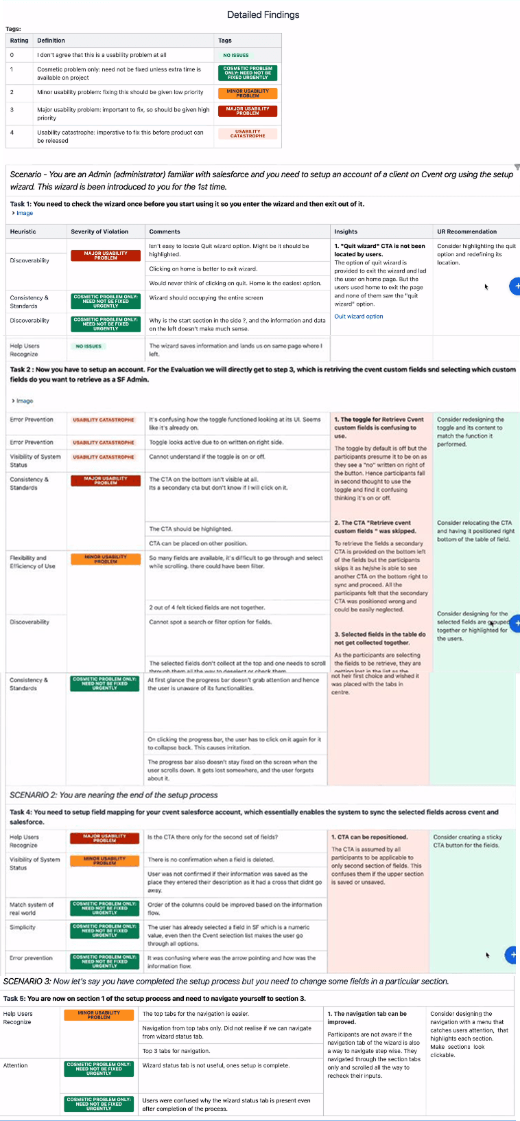
Summary of findings
Research insights were grouped into high-priority usability issues, forming the basis for design recommendations focused on navigation, progress visibility, task sequencing, and interaction patterns.
Affinity Mapping
After the heuristic evaluation, affinity mapping was used to organize usability findings into recurring themes. This helped identify common pain points, prioritize improvements, and inform design recommendations.
Design Recommendations
Key usability themes were translated into actionable design recommendations, focusing on improving navigation, task sequencing, interaction patterns, and system feedback.
Defining the Design Direction
The research findings were synthesized into a clear design challenge: improve the efficiency of the Setup Wizard by addressing the most critical usability issues. Based on the identified user scenarios, the MVP focused on enabling intuitive navigation, improving task completion, providing clear progress tracking, and creating an informative syncing experience.
The problem statement
Defining the MVP
Wireframing the solutions
The Redesign
Connect to Cvent
The redesign at a glance
Seen together, the reworked screens show the through line: the quit wizard surfaced, the progress bar and navigation aligned, the custom field toggle and its table cleaned up, and the calls to action placed where people actually look.
First Impression Test
The redesigned Setup Wizard was evaluated through a first impression test to validate the effectiveness of the design changes and identify any remaining usability issues before finalizing recommendations.
- Step 01 / 03
The moderator guide: welcome script and the first probes.
- Step 02 / 03
Probes for the navigation, the toggle and the field retrieval.
- Step 03 / 03
The overall rating and the wrap up.
- Step 01 / 03
The moderator guide: welcome script and the first probes.
- Step 02 / 03
Probes for the navigation, the toggle and the field retrieval.
- Step 03 / 03
The overall rating and the wrap up.
Final Design Recommendations
The first impression test helped identify the remaining usability gaps, resulting in final recommendations to improve filter discoverability and make the wizard exit flow clearer and more predictable.